In anatomical illustration, color is more than a matter of taste. The colors you use decide what learners see first and what they see later. AnatoBase uses color as a tool to deliver information. Here is our color system, built on three principles.
Gray base
Keep the overall structure neutral
Accent color
Highlight the structure you need to see
Secondary accent
Mark the structures connected to the key one
Gray base
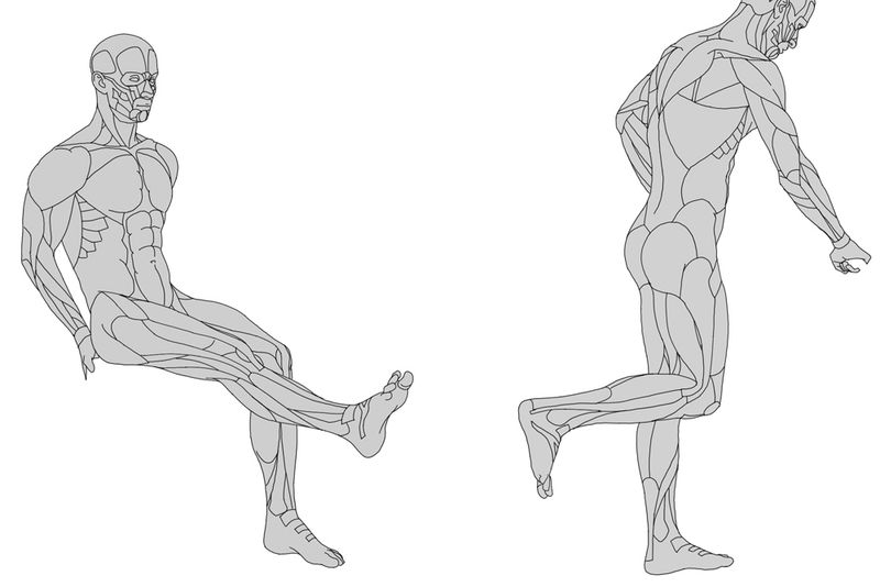
The overall structure is kept in gray · Low contrast between light and dark · No excess visual noise
Gray is the most neutral color and does not get in the way of form. We use it as the base color for every figure, so the basic structure reads clearly. Painting every structure in its own color looks vivid, but the thing you need to see gets lost in it. AnatoBase keeps the base tone gray and uses color only where you need to look, so the learner's eye stays on form and on the key structure.
Accent color
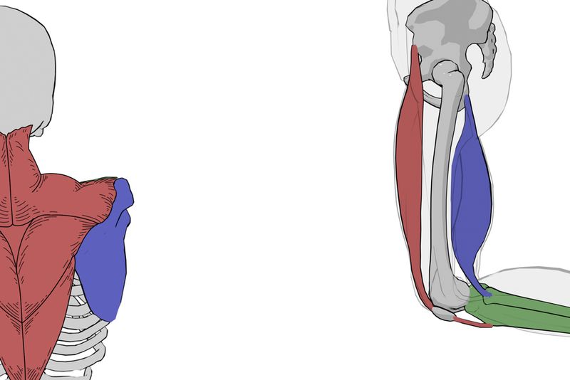
Color only on functionally important muscles, bones, and structures · Clearly separated from what is around them · As few colors as possible
The accent color is not decoration. It is a visual signal that points to the structure you need to see now. When only that structure is colored on a gray background, the learner's eye goes there on its own. Even in a crowded area where dozens of muscles overlap, the accent color clearly says "look at this now." Using less color makes the information easier to take in.
Secondary accent
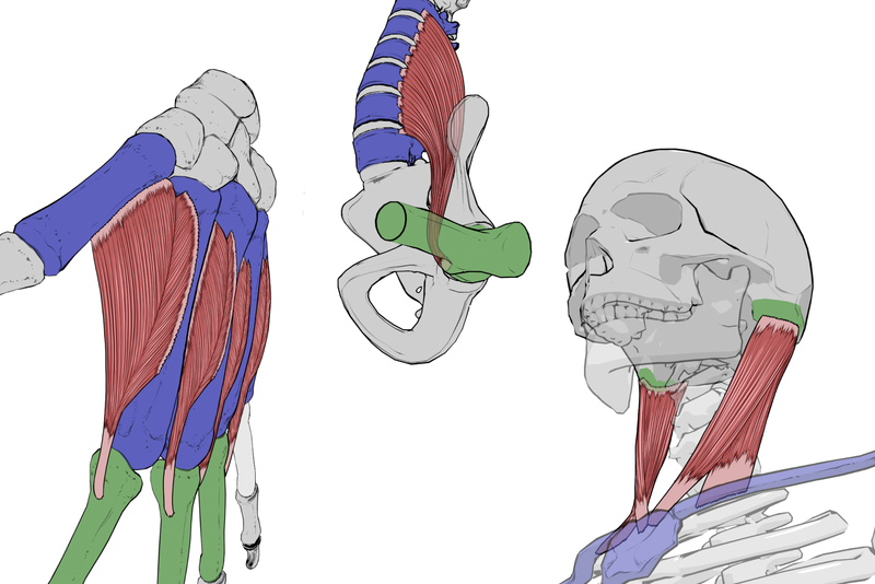
A second color for structures connected to the key muscle · Shows paired relationships such as origin and insertion · A quieter tone than the main accent, to preserve the visual hierarchy
Sometimes one accent color is not enough: you also need to show what connects to the key structure, such as where a muscle starts and where it attaches. That is where the secondary accent comes in. If the main accent points to the muscle you are looking at, the secondary color marks what goes with it, such as the bone it attaches to. We still keep the number of colors to a minimum, and the secondary color sits one step quieter than the main one, so the visual hierarchy stays clear.
"A good anatomical illustration does not show everything. It shows exactly what you need to see now. Color is the strongest tool for making that choice."
AnatoBase Art DirectionColor design principles
Gray grounds the whole image, the accent color points to the key structure, and the secondary accent marks what connects to it. These three layers are the whole AnatoBase color system. We aim for clarity, not flash.